
Ecommerce UX Analytics for Modern UX Teams

Why Your UX Team Needs Ecommerce Analytics: How to Connect Customer Experience to Revenue
Ecommerce UX analytics is the practice of measuring how shoppers experience an ecommerce site — combining behavioural data (clicks, scrolls, funnel paths), experience signals (rage clicks, hesitation, abandonment), and technical context (errors, performance) in a single view. For UX teams, it answers a question traditional analytics can't: not where shoppers go, but why they hesitate, struggle, or leave. And critically, it ties those moments back to revenue.
This post explains what ecommerce UX analytics is, what it does that traditional UX tools don't, and how UX teams at brands like Aeroflow Health, Harman, and Rvinyl use it to turn real customer behaviour into design decisions that move conversion.
The visibility gap UX teams quietly inherit
Most UX teams have a respectable stack. A heatmap tool. A session recorder. A survey tool, maybe. Quantitative analytics from GA4. The team can see what users click, how far they scroll, and how a page ranks for engagement.
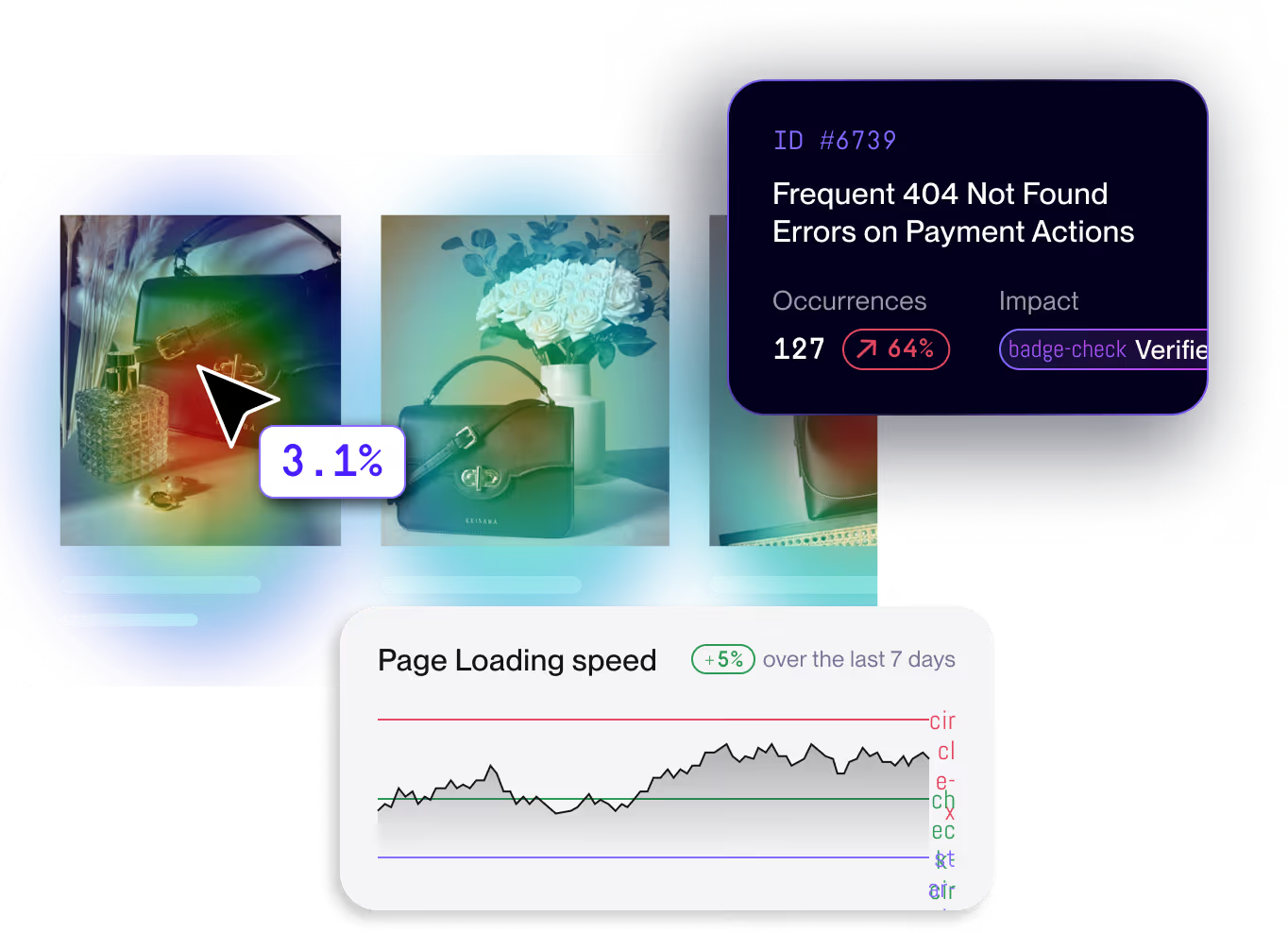
What that stack rarely shows is what the experience actually feels like to the shopper. Click data tells you a button was tapped. It doesn't tell you the shopper tapped it three times before it responded. Heatmaps tell you which sections of a page draw attention. They don't tell you that the PDP took four seconds to load, or that the "Add to Cart" button fired a silent JavaScript error 8% of the time on Safari.
This is the gap UX teams quietly inherit. Click data shows interaction. It doesn't show experience. And when something breaks the experience, it usually doesn't look like a design problem at first — it looks like a conversion drop with no clear cause.
The result: UX teams end up making design decisions without the full picture, and defending those decisions to stakeholders with the same surface-level data that created the ambiguity in the first place.
"Noibu helps us identify UX issues by surfacing sessions based on user behavior. Instead of sifting through quantitative data, we can watch real users and see their pain points in real life."
— Meredith Eads, Product Design Manager, Aeroflow Health
What ecommerce UX analytics actually means
The term "UX analytics" gets used loosely. For ecommerce teams, it has a more specific meaning.
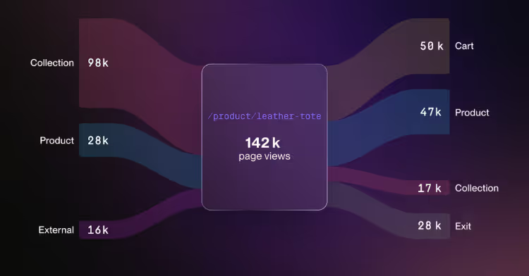
Ecommerce UX analytics is the discipline of measuring how shoppers move through an ecommerce site — from landing page to PDP to cart to checkout — and connecting that behaviour to conversion outcomes. It's distinct from generic UX research tools in two ways.
First, it's funnel-aware. A click on a homepage hero is different from a click on a checkout CTA. A scroll drop-off on a PLP is different from a scroll drop-off on a confirmation page. Ecommerce UX analytics understands those distinctions because it's built around the ecommerce journey — PDP, PLP, cart, checkout — not generic site analytics.
Second, it ties experience to revenue. A rage click on a generic site is a usability signal. A rage click on a "Place Order" button is a quantifiable revenue loss event. Ecommerce UX analytics doesn't just show the friction — it shows what the friction costs.
This matters because UX teams are increasingly held to commercial outcomes. The discipline has matured past "design improves usability" and into "design improves conversion." The tooling needs to match.
The three layers UX teams need to see together
Useful ecommerce UX analytics combines three layers of signal. Most tools deliver one. The teams that drive the most measurable conversion lift work with all three at once.
1. Behaviour: what shoppers do
This is the foundation. Heatmaps, scroll maps, entry and exit flows, and aggregated click patterns across page groups like PDPs, PLPs, and checkout templates. The goal isn't to record individual moments — it's to understand patterns at scale. Where do shoppers focus? Where do they ignore? Where do they bounce? What does the journey actually look like across thousands of sessions, not just the one your designer just watched?
Most UX teams already have some version of this. The problem is that behaviour alone is descriptive, not diagnostic. You can see what's happening, but not why.
2. Experience: how it feels
This is where session replay and friction signals come in. Rage clicks, dead clicks, repeated form submissions, hesitation patterns, scroll thrashing. These are the moments where the shopper's behaviour reveals frustration — even if they ultimately convert.
Friction signals matter for two reasons. First, they identify usability problems that don't show up in click data because the click eventually happens. Second, they reveal experience quality among users who convert, which is the strongest leading indicator of repeat purchase and brand trust.
3. Technical context: what's actually happening underneath
This is the layer most UX tools skip — and it's often where the real cause of UX friction lives.
A "Continue to Payment" button that doesn't respond on first click isn't always a design problem. Frequently it's a JavaScript error. A PDP image that loads visibly slowly isn't a layout issue — it's a Core Web Vitals problem. A checkout abandonment spike on Tuesday morning isn't a customer mood — it's a regression introduced by Monday's release.
UX teams that operate without technical context end up redesigning things that don't need redesigning, and missing the fixes that would actually move conversion. The teams that have technical visibility alongside their behavioural data move faster and ship more decisively, because they can tell the difference between a design problem and a code problem before they spend a sprint on the wrong one.
"We've seen cases where users 'rage click' but still convert — which is not the experience we want. Being able to see that type of emotional behaviour allows us to fix the friction and improve the journey for next time."
— Julian Charnas, Director of Digital Commerce, Harman Inc. (JBL)
.avif)
From design decisions to revenue impact
The most consequential shift in modern UX practice isn't a new methodology — it's the expectation that UX outcomes be measured in dollars.
That's a problem when the UX team's tooling stops at engagement metrics. A 12% increase in scroll depth on a PDP is interesting; it's not budget-defensible. A 6% lift in PDP-to-cart conversion across a redesigned product gallery is.
Ecommerce UX analytics closes this gap by attaching every friction point and every fixed friction point to a conversion outcome. When the team can show that resolving a checkout-stage friction pattern recovered $96,481 in revenue across four months — as one Noibu customer did — design decisions stop being subjective.
This is the operating model shift: UX moves from "we improved the experience" to "we recovered $X in conversion." It changes how the team is funded, how it prioritizes, and how stakeholders engage with design work. The roadmap stops being a debate about taste and starts being a debate about impact.
Where most UX analytics tools fall short
UX teams evaluating their stack tend to compare tools by feature checkbox. Heatmaps, check. Session replay, check. Funnels, check. The feature surface looks similar across vendors — which is why the differences only become obvious in production, when the team tries to actually do something with the data.
Below is a side-by-side of where most UX analytics tools fall short for ecommerce, and what changes when the platform is built specifically for ecommerce teams.
The pattern is consistent. Generalist UX tools were built to serve a broad spectrum of industries — SaaS, automotive, real estate, healthcare. They can be configured for ecommerce, but the funnel stages, the revenue attribution, and the technical context that ecommerce teams need either don't exist or take significant analyst time to build.
What changes when UX has the full picture
When UX teams operate with full visibility — behaviour, experience, and technical context together — the team's role inside the business changes.
Design moves from opinion to proof. Stakeholder debates over redesigns shift from preference arguments to revenue arguments. The team brings clear visual evidence — sessions, friction signals, conversion deltas — to every recommendation.
Research accelerates. Instead of spending a week recruiting users for a moderated study, the team queries the actual behaviour of thousands of real shoppers and validates or invalidates hypotheses in minutes. AI-assisted session search surfaces the patterns that matter without manual sifting.
The team stops fighting the wrong battles. A conversion drop on a redesigned PDP is no longer ambiguous — it's diagnosable. The team can immediately see whether the issue is design, performance, or a release-induced regression. That clarity prevents the most expensive UX mistake: rebuilding something that wasn't actually broken.
UX gains a seat at the revenue table. When the team can quantify the conversion impact of design work, it stops being a service function and starts being a growth lever. The roadmap commands respect because the numbers are real.
"No other tool aggregates heatmaps like Noibu. Most of our customers come in on product pages (PDPs) rather than the homepage. Being able to see the journey across those thousands of specific pages allowed us to surgically improve the experience and increase our average order value by 11%."
— Philip Krynsky, CEO & Founder, Rvinyl
See where your shoppers are quietly losing trust
If your UX team is making decisions on click data alone, you're guessing at half the picture. The other half — the friction, the failed interactions, the technical issues silently shaping how the journey actually feels — is where most of the recoverable conversion lives.
A Noibu free website audit shows you what your current tools miss. Hidden friction. Revenue at risk. The friction patterns your shoppers experience but never report. No setup. No commitment.
Related topics
- How ecommerce teams reduce conversion-blocking friction across the funnel
- Page Analysis and Digital Experience Analytics: a practical guide for ecommerce
- Noibu vs. Contentsquare: ecommerce UX analytics compared
- The ecommerce site problem nobody talks about (because your tools don't show it)
About Noibu
Noibu is the leading ecommerce analytics & monitoring platform, purpose-built to help retailers protect and grow online revenue. By unifying site monitoring, experience analytics, and conversion growth opportunities in a single pane of glass, Noibu captures the most important end-to-end shopping data, without the complexity of traditional analytics tools.
Noibu surfaces critical site errors, performance issues, and customer journey friction that block conversions, then ties every insight directly to business impact, session replays, and full technical context. This makes it easy for ecommerce teams to understand why things are happening and what to prioritize, without dedicated analytics headcount.
The result: faster decisions, better collaboration across teams, optimized customer experiences, and revenue growth.


.png)